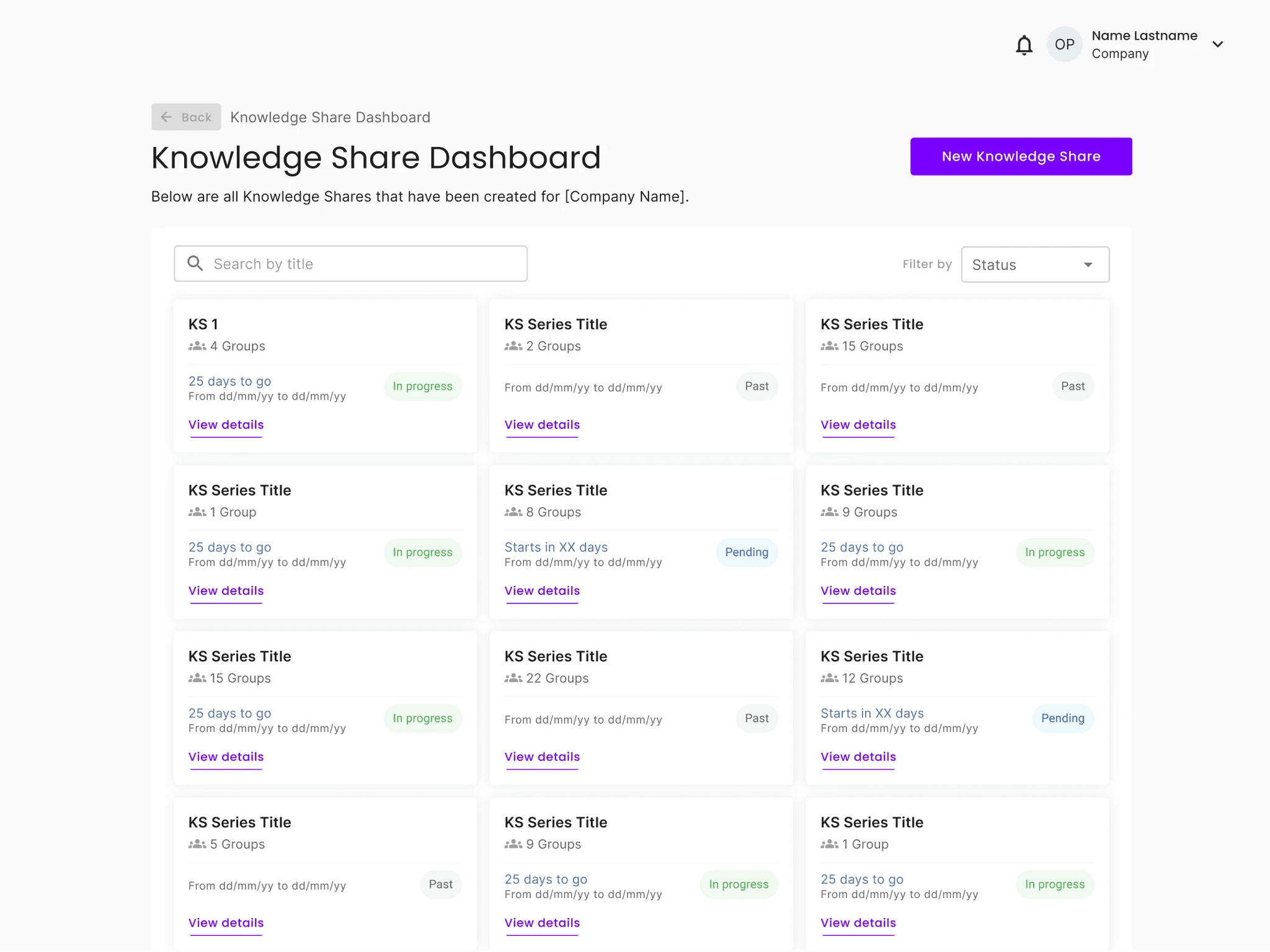
Designed a dashboard that empowers managers to monitor their team’s knowledge sharing progress quickly
Designed a dashboard that empowers managers to monitor their team’s knowledge sharing progress quickly

JUNE 2024

my role
Product Designer — Led the design for the entire feature end to end, including the UX, UI and User Testing
Team
Cross Functional Team — 1 PM, 2 Developers, 1 QA
duration
2 months — total development and multiple iterations
impact
The manager dashboard significantly improved the user experience by reducing the number of required actions and making information easier to understand.
The manager dashboard significantly improved the user experience by reducing the number of required actions and making information easier to understand.
72%
Task time reduction
60%
Improved decision making efficiency
context
Managers at Sugarwork lacked a centralised view of knowledge-sharing conversations happening across teams, making it hard to track progress and take the required action.
Sugarwork is a tacit knowledge sharing platform where multiple teams engage in guided conversations to share and document internal knowledge. However, the outcomes were fragmented across platforms and emails, making it difficult for managers to track progress or identify gaps.
opportunity
How might we make it easy for admins to track progress, schedules, and key metrics to manage groups and ensure steady progress effectively?

Key goals
Goal 1
Present key data to managers in an easily digestible and well-organized format
Goal 2
Minimize friction by offering key information in a single, easily accessible location
Solution
Designed a hierarchical, data driven dashboard to give information at a glance
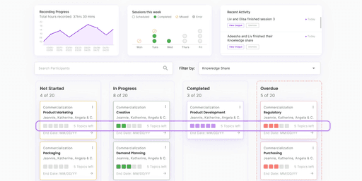
We structured the design around five key elements to enhance clarity and efficiency. Kanban boards provide a quick visual snapshot of each group's progress, while progress data offers insights into overall team performance. The schedule helps track timelines and keep everyone on course. Recent activity highlights the latest outputs, enabling timely follow-up actions, and filters make it easy to sort and navigate content based on what’s most relevant.

Design decision 1
Introduced a Kanban-based layout instead of a table to improve how users scan, understand, and find content

Option 1: Kanban

Option 2: Table
Design decision 2
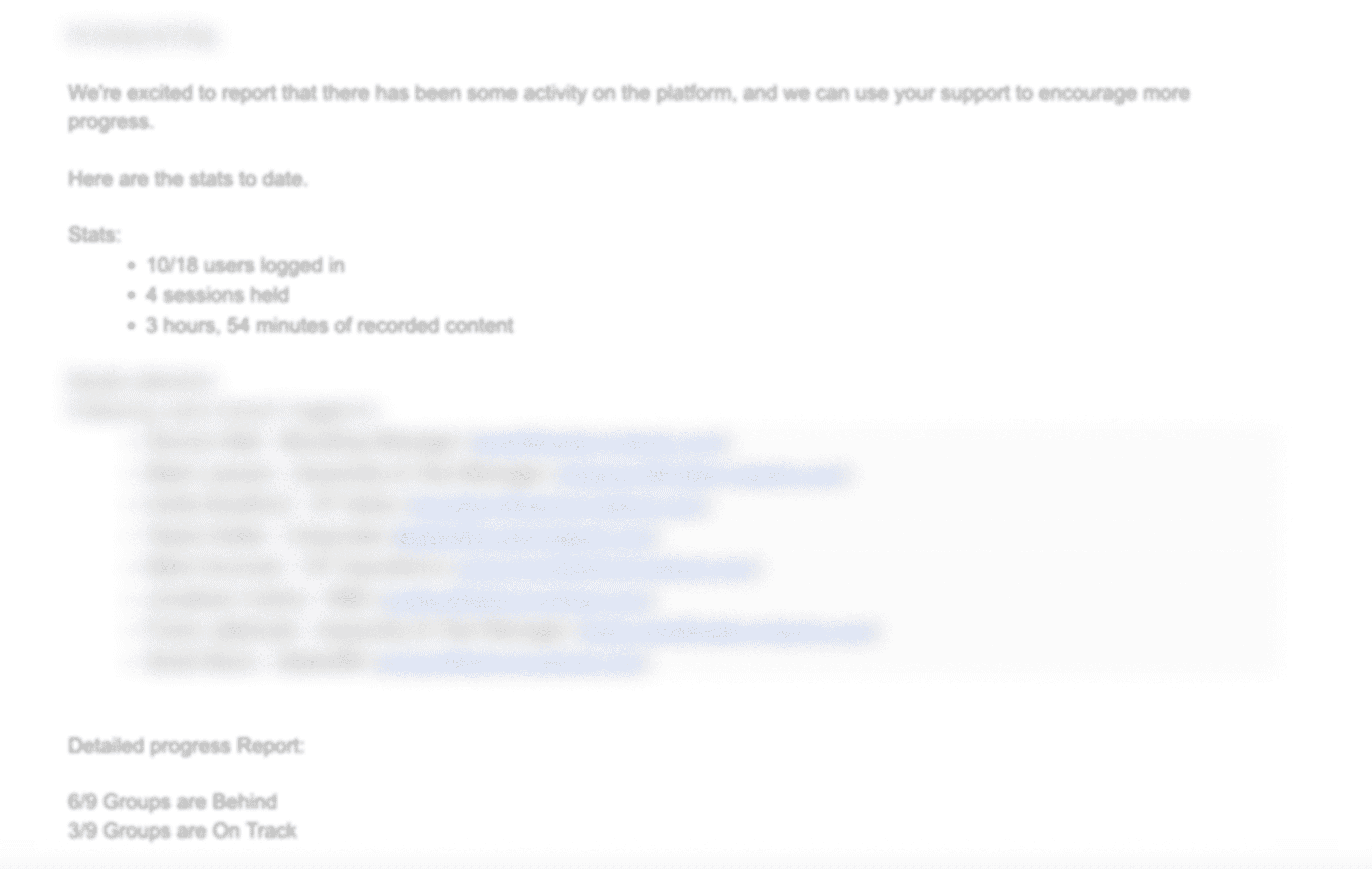
Transformed static email data into visualization for at-a-glance analysis

Design decision 3
Introduced visual progress indicators for each group to simplify tracking and accountability
Key learnings
Feedback and data are king
Metrics were useful, but feedback helped us understand which ones really mattered. Adjusting the dashboard to highlight the most important data made it much more valuable for users.
Hierarchy and color can change how information is percieved
Using color and a clear layout made the data way easier to read and understand, helping users quickly find what they needed.
Scalability could be an issue in long term
While our design made content easy to understand for our specific use case, we realized that scalability could be a challenge, especially when representing larger sets of data. We must keep scalability in mind while designing the feature.
context
Managers at Sugarwork lacked a centralised view of knowledge-sharing conversations happening across teams, making it hard to track progress and take the required action.
Sugarwork is a tacit knowledge sharing platform where multiple teams engage in guided conversations to share and document internal knowledge. However, the outcomes were fragmented across platforms and emails, making it difficult for managers to track progress or identify gaps.
opportunity
How might we make it easy for admins to track progress, schedules, and key metrics to manage groups and ensure steady progress effectively?
Key goals
Goal 1
Present key data to managers in an easily digestible and well-organized format
Goal 2
Minimize friction by offering key information in a single, easily accessible location
Solution
Designed a hierarchical, data driven dashboard to give information at a glance
We structured the design around five key elements to enhance clarity and efficiency. Kanban boards provide a quick visual snapshot of each group's progress, while progress data offers insights into overall team performance. The schedule helps track timelines and keep everyone on course. Recent activity highlights the latest outputs, enabling timely follow-up actions, and filters make it easy to sort and navigate content based on what’s most relevant.
Design decision 1
Introduced a Kanban-based layout instead of a table to improve how users scan, understand, and find content
Option 1: Kanban
Option 2: Table
Design decision 2
Transformed static email data into visualization for at-a-glance analysis
Design decision 3
Introduced visual progress indicators for each group to simplify tracking and accountability
Key learnings
Feedback and data are king
Metrics were useful, but feedback helped us understand which ones really mattered. Adjusting the dashboard to highlight the most important data made it much more valuable for users.
Hierarchy and color can change how information is percieved
Using color and a clear layout made the data way easier to read and understand, helping users quickly find what they needed.
Scalability could be an issue in long term
While our design made content easy to understand for our specific use case, we realized that scalability could be a challenge, especially when representing larger sets of data. We must keep scalability in mind while designing the feature.